This was my second year in AP Studio... and it was a totally different experience than the one prior. This year contained more opportunity for me to step outside the normal comfort zone that I typically reside in. I was nervous at first, but what came out of it blew my mind. I absolutely loved my breadth and exploring past and new art techniques. But my favorite was creating my concentration. I didn't know exactly what I wanted to do, but I knew it was going to have to do with surface paintings. Ever since the surface painting project from my sophomore year surface problems have intrigued me. After my first pomegranate piece I knew I would focus on the food aspect of food paintings... and I enjoyed every moment of it, pushing myself through all 12 pieces.
Bon Appetit!
Next year I'm going to be attending the University of Northern Colorado for a degree in elementary school education. I want to minor in art, and/or if I become really adventurous I want to double major in Art Education as well.
Bon Appetit!
Next year I'm going to be attending the University of Northern Colorado for a degree in elementary school education. I want to minor in art, and/or if I become really adventurous I want to double major in Art Education as well.
Breadth
|
This Piece is graphite and charcoal. It was based on a project to do an enlarged drawing of a part of the body. I used a photo of my mom's hands as reference for this piece.
|

|
|
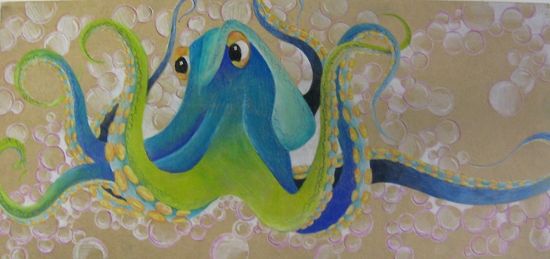
This octopus is prisma pencil and acrylic. It is a more abstract piece ecspecially with the bubbles in the background.
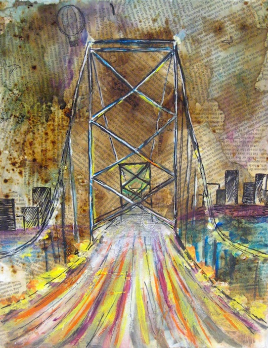
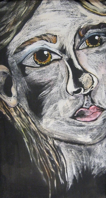
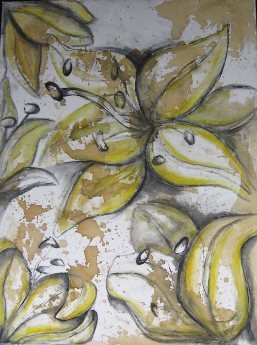
This bridge is based on a project where we pulled a letter out of a hat. I got the letter B so I chose a bridge. I liked the looseness of the lights on the bridge. This piece is an ink resist based on a drawing of a girl Valerie in my class. I didn't like it at first but I think it turned out pretty strong. This piece was made when we worked with an artist named Tadashi. We started with a coffee back ground and on top we put our depictions of the flowers we were holding. Last year we did this as well and this year my piece turned out much looser, and I really liked it. |

This piece I named "Apple Sauce". It got an honorable mention at the 2015 Scholastic Awards. I really struggled with the shapes of the apples in these piece but after I took a step back and made the apples more stylized I really began to like this piece. I like how loose the background is compared to the apples and the hands I think it adds a nice contrast.

This piece was for a Dia De Los Muertos project. It is water color, acrylic and pencil on canvas.
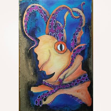
This piece is acrylic on cardboard.
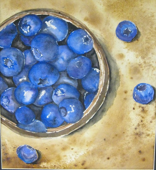
Concentration
My concentration is based off of the idea of surface paintings of different foods and delicious delicacies.

Popsicle:
This piece is watercolor, and is the second piece in my concentration.
This piece is watercolor, and is the second piece in my concentration.

This was my 3rd concentration piece. I really loved the layers that were in this burger. Also the seeds is what really stood out to me when I completed this piece.
Mixed Media.
Mixed Media.
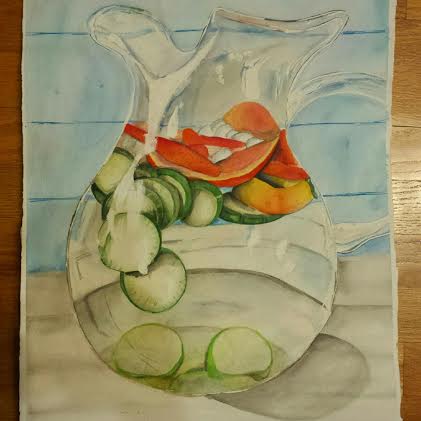
The photo reference for this image really intrigued me because of how the solid fruit pieces intertwine with the reflective glass.
Water Color and Acrylic
Water Color and Acrylic
Mixed Media.
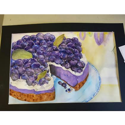
I absolutely love this piece. Every time I look at it I get hungry. The glaze over the blueberries creates such realism and contrast from the whipped cream and the crust of the pie.
I absolutely love this piece. Every time I look at it I get hungry. The glaze over the blueberries creates such realism and contrast from the whipped cream and the crust of the pie.
|
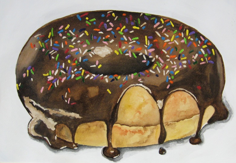
I love sprinkle donuts. While painting this one, I ate a few for inspiration. This work is Mixed Media on watercolor paper.
|
|
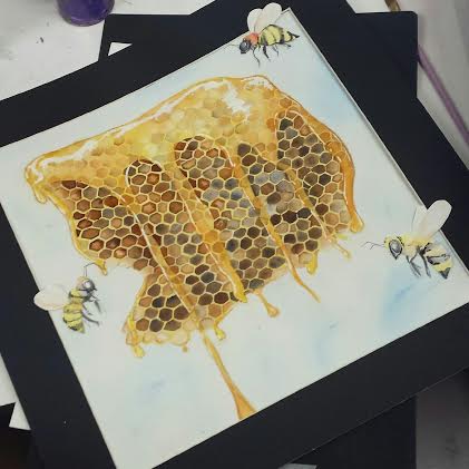
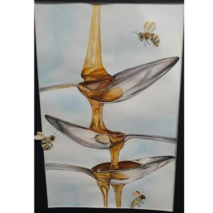
These two pieces were numbers 10 and 11 in my concentration, and showed me how much I can push myself artistically. These two pieces connect with one another. I love the fluidity within them both and how it works along side very stiff images of the spoons and honey comb.
Mixed Media.
Mixed Media.
|
|
